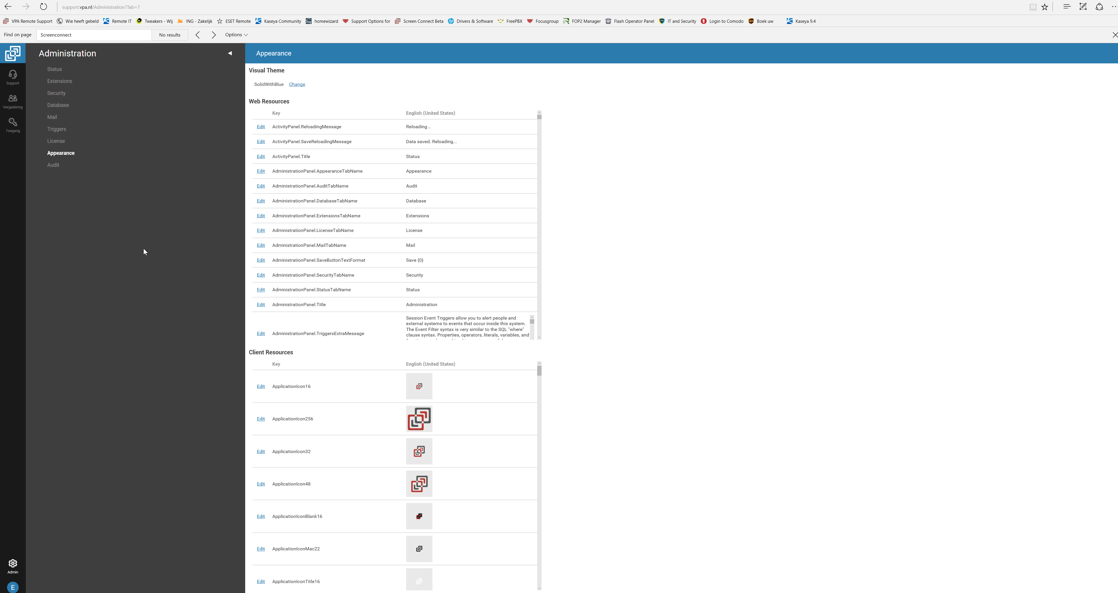
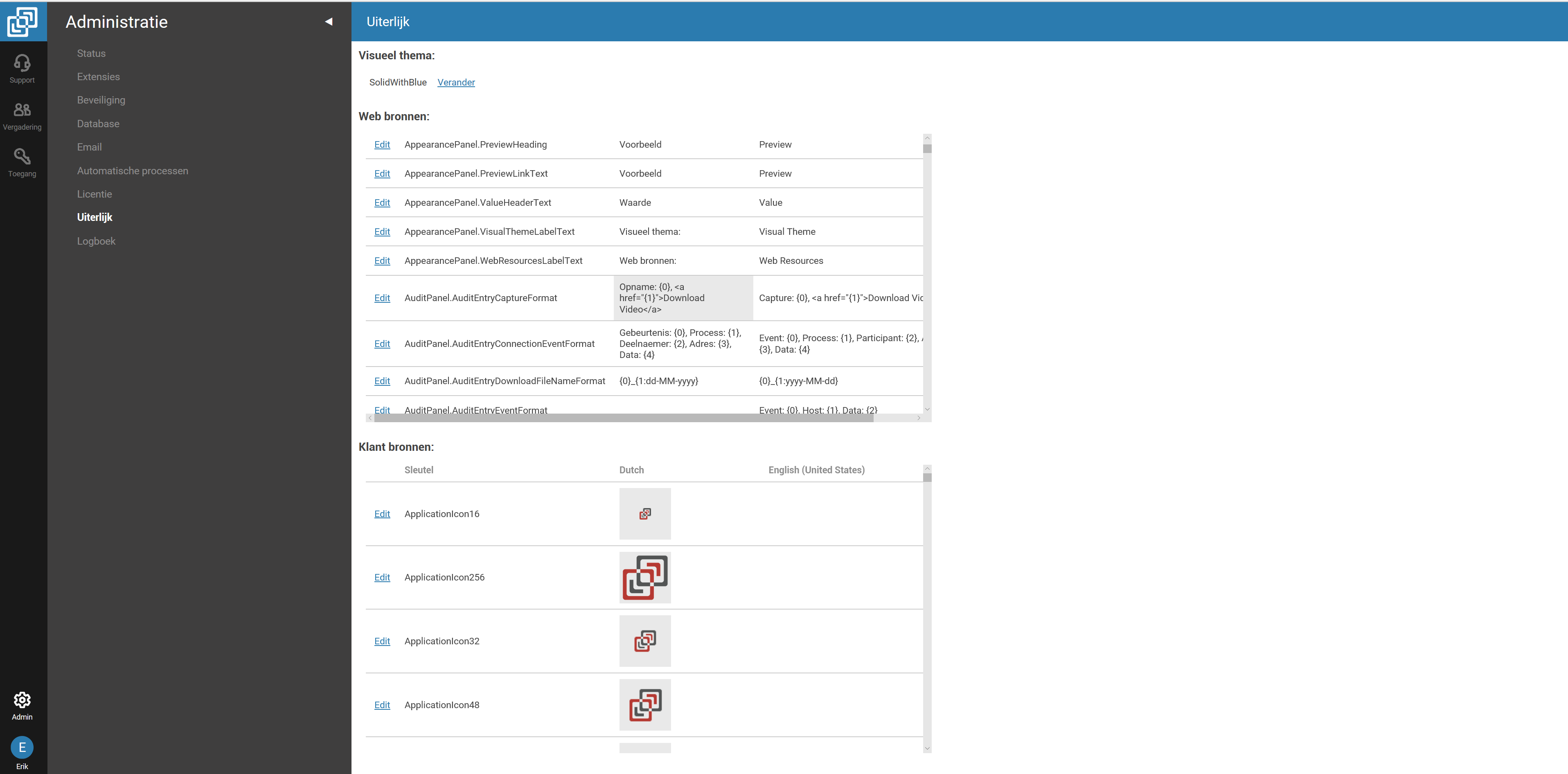
appearance scrollbars way too much to the left
In the newest 6.1 version if you go to Appearance the scrollbars for the fields is placed way to much to the left. Meaning you can only usage a small percentage of your screen.
I have a very high resolution screen, but on an normal 1920x1080 screen it is also not good.
I checked on our beta testing machine it did not have the problem in version 6.1.11836.6157
However as soon as I also updated that one to 6.1.12292.6236 the same problem started.
Hope this helps.
Kind regards,
Erik


Good morning,
Thank you for submitting this information. The style you describe is an intended change made to the administration user interface in 6.1. As such, I am going to move this thread to our feature request forum for additional consideration.
Please feel free to update this thread with additional comments regarding the requested appearance.
Cheers,
Ben