resize columns in admin portal

It would be nice if you could resize the width of the columns in the admin portal. Kinda like this:
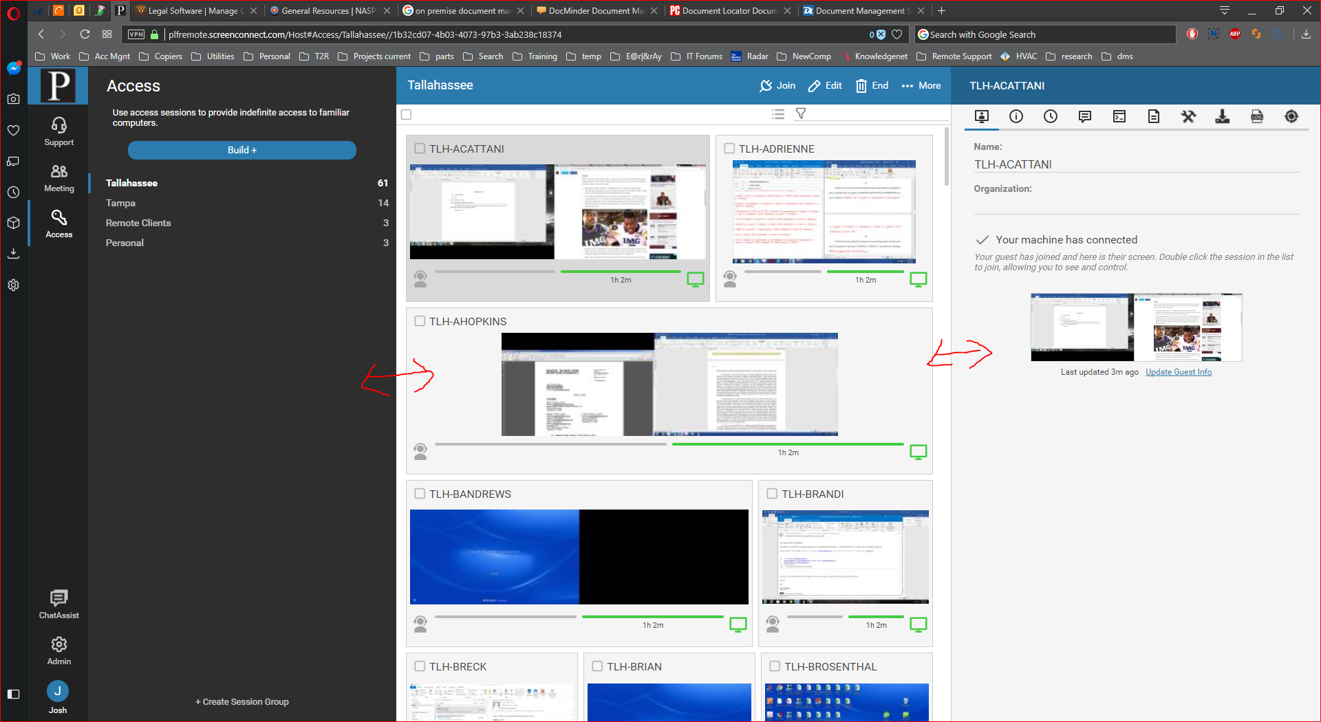
It would be nice if you could resize the width of the columns in the admin portal. Kinda like this:
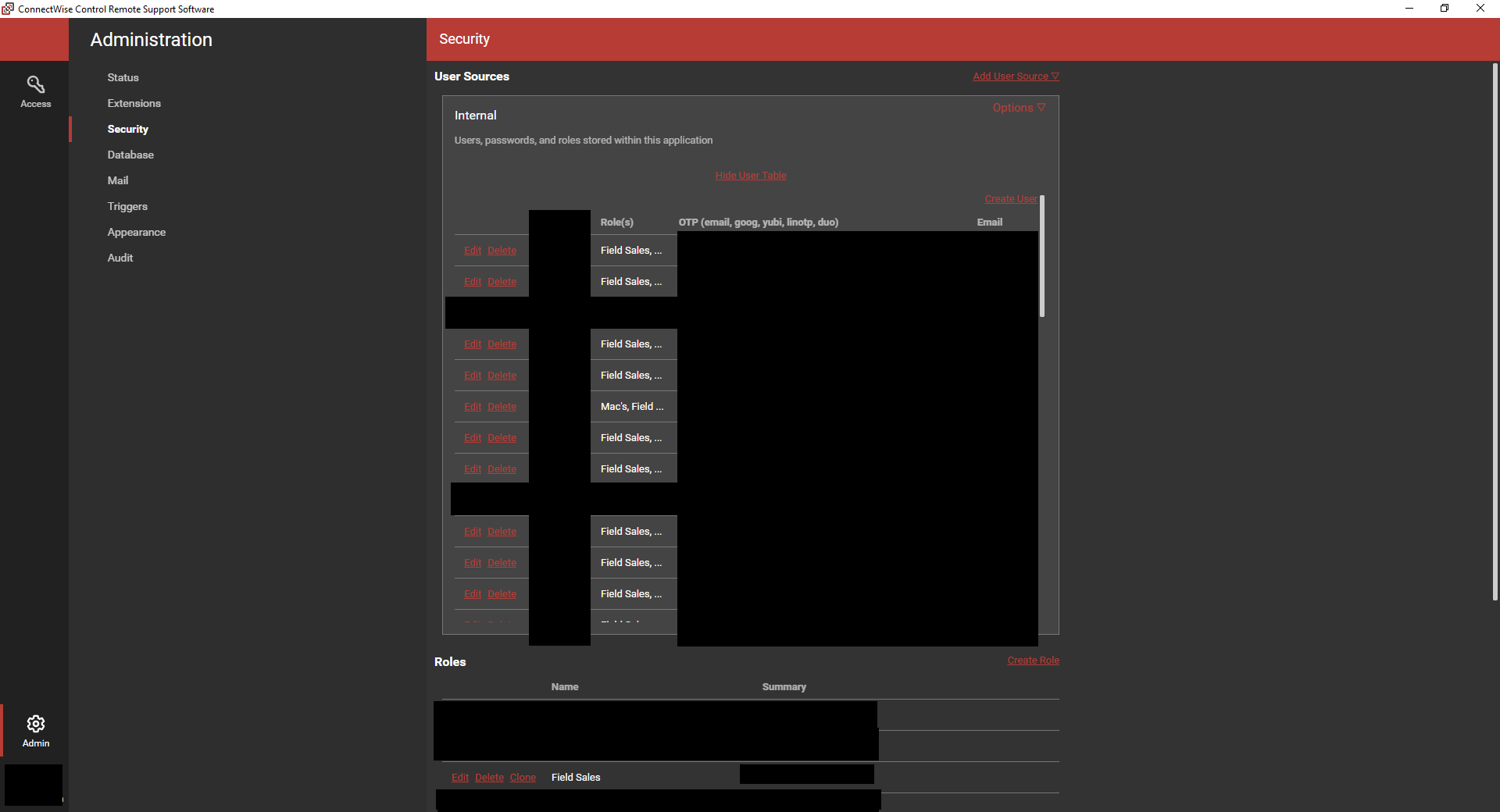
Would be really nice to see a way to dynamically resize the host page panels as well as other UI elements such as the Administration pages (Specifically the Security Pane is not responsive to window size change at all... We can not even see which session groups a user is part of unless you manually click into each user as we assign several security roles to each technician)
I am aware of the "Move Session Details Location" extension on that is great if you want to move things around or hide them but has not been stable in recent releases.
Also aware of the "Expand and Minimize Host Page Panels" extension but it only allows for two default sizes... And only works on the Host Page Panels as described.

On the Host Access page, there currently is no way (under the default theme w/o any skin extension installed) to change the widths of the columns.
Under Administration page, Appearance...
Visual Theme
It would be helpful to have a toggle of "standard" or "flexible" column widths
Currently, there is an extension for this - it's version 1.0, (has been updated by t2service Modified 7/9/2017)
NOTE: But it does NOT work with build ScreenConnect_6.3.13446.6374_Release (as of 09/14/2017)

Resizing UI elements in general has been requested a number of times. Last I read was "maybe in 6.5".
To expand on this request, column width should be user controlled. And not just the columns Josh has shown. Within the main (middle) panel, the width of the items should also be adjustable. I've got a display 2560 pixels wide, at 100% font size (not scaled up) and I can only get about 30 characters of an access session's name because the green/grey bars chew up so much space.
I get it that this is very tablet-friendly, but all the fixed-width elements working on percentage of screen width really reduces usability.


I do not need to see the Status Connection columns so large. It's much more important to see the host names. They are being cut off because of connection status columns.n